

A+ Content · July 12, 2026 · 6 min read
Choosing A+ Content modules that answer buyer questions
A+ Content is not decoration below the fold. Treated as a question-answering system, the module choice becomes obvious — and the page starts converting.
By Nuong Nguyen
By the time a shopper scrolls to A+ Content, they are interested but unconvinced — the gallery caught them, the price did not scare them away, and now they are looking for a reason to commit or a reason to leave. The job of each A+ module is to remove one specific reason not to buy. Start from the objections — ingredients, sizing, compatibility, durability, "which variant is for me" — then pick the module that answers each one best. (If you are new to the format, Amazon's A+ Content overview covers eligibility and the module catalogue.)
Why "make it look premium" is the wrong brief
The most common A+ failure is aesthetic: beautifully art-directed banners that restate the product name six ways and answer nothing. Shoppers do not reread the brand story — they scan for their own question. A module that does not map to a real objection is spending your most persuasive screen real estate on wallpaper. The discipline is the same one behind a well-planned image gallery: every unit of space answers exactly one question.
A module structure that keeps working
- Open with a full-width banner that restates the core promise visually — the product in its use context, not a second logo slot.
- Use standard image-and-text modules for the two or three heaviest objections, one objection per module.
- Answer "which one is for me" with a comparison chart that cross-sells your own catalogue instead of leaving the shopper to search again — a shopper who leaves to compare rarely comes back to you.
- If you have Brand Registry history, test Premium A+ (A+ Premium adds video and interactive modules) on your best-traffic ASIN first, where the lift is measurable.
This is easiest to see in a real set. On a precision nail clipper we built the A+ for, each module removes one grooming objection in turn — sharpness, a no-tear cut, safety near skin, portability, results — instead of restating the brand five times. A product that competes on trust rather than price lives or dies on exactly that discipline.
Write the text for scanners
A+ body text renders small and most of it is never read. Put the answer in the headline, the evidence in the image, and keep body copy to one or two sentences of support. Alt text matters here too — A+ image text is not indexed the way page copy is, so key claims should exist as real text somewhere in the listing.
A+ and the gallery are one system
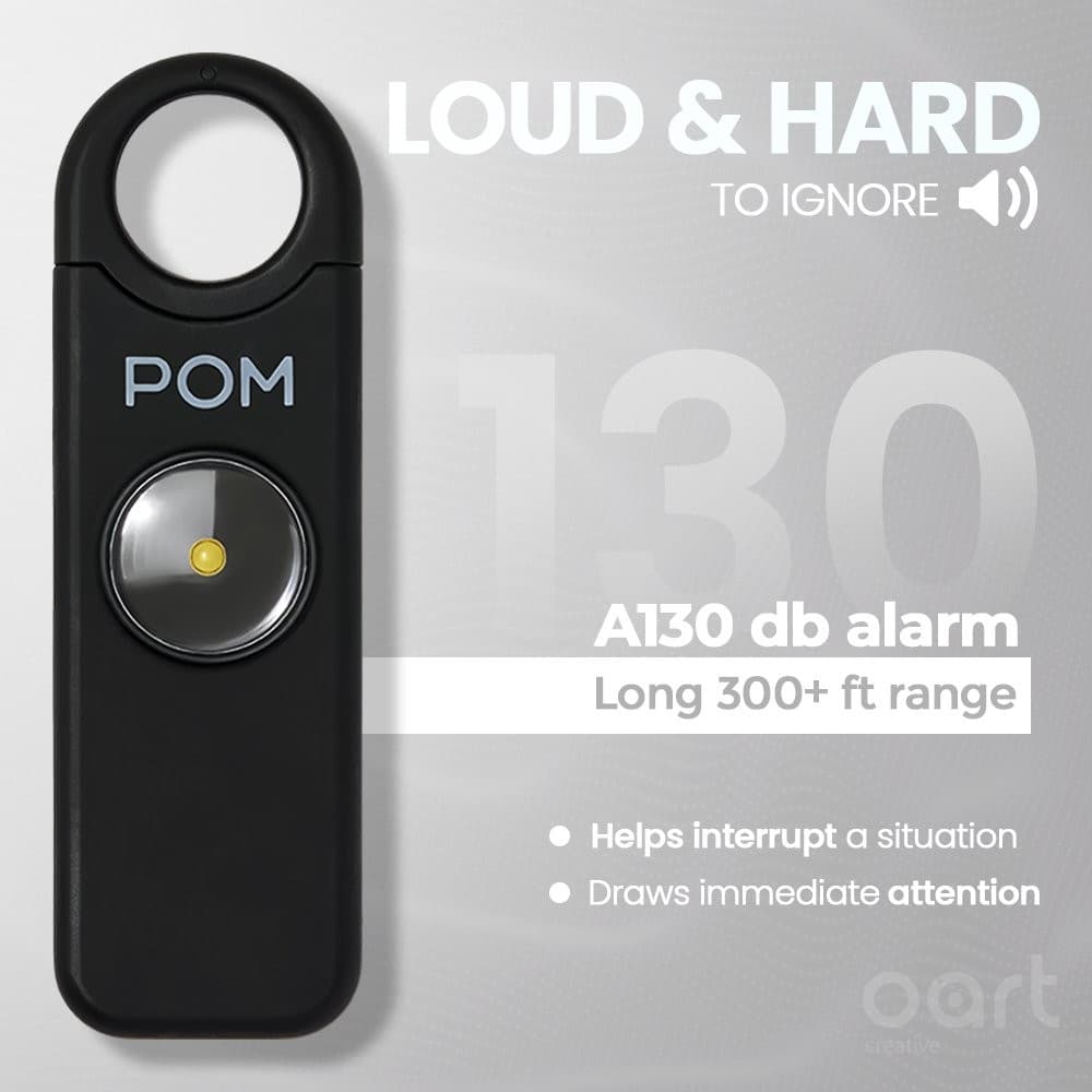
The gallery converts the fast decision; A+ converts the considered one. Plan them together so they divide the objection list instead of repeating it — the gallery takes the visual, instant questions (what is it, how big, what's included), A+ takes the ones that need room (how it works, what it's made of, which variant, why this brand). That division of labour is how we planned the POM Industries listing, and it is the core of our A+ Content service. Since May 2026 the same system can run at Premium size at no extra fee — the gate and the build order are in Premium A+ Content is free now.
Frequently asked questions
- Does A+ Content actually improve conversion?
- Amazon itself states A+ Content can lift sales when used well, and our experience matches — but the lift comes from answering objections, not from decoration. Measure per-ASIN before/after with the same traffic conditions rather than trusting a blanket percentage.
- Who can use A+ Content?
- Sellers enrolled in Amazon Brand Registry (and vendors). Basic A+ is free; Premium A+ availability depends on your account's eligibility. Check the requirements in Seller Central before planning modules you may not have access to.
- Should the same A+ design be reused across all ASINs?
- Reuse the system, not the pages: shared visual language, grid and module logic, with per-ASIN answers swapped in. That keeps the brand coherent while every product still addresses its own objections — and it makes each new ASIN dramatically cheaper to launch.